TiriVelo
A Trust and Safety page that shows pet owners how sitters and dog walkers get approved and shows future providers what signing up involves.
View Prototype
Year
2026
Duration
5 Weeks
Role
UX Designer

The Problem
TiriVelo vets every dog walker and sitter.
Pet owners have no way to see how.
What Was Verified?
Nothing on a sitter or dog walker's profile showed which details TiriVelo had checked.
A Story Told Three Ways
The site described its safety promises 3 different ways.
A Page That Didn't Exist
Links on the site already pointed to a Trust and Safety page that hadn't been built.
The Solution

The Provider's Road to Approval
Five steps show what every dog provider completes before they can accept bookings.

Proof on Every Profile
Two badges show pet owners which providers TiriVelo has verified and which have earned their trust over time.

No Fine Print
A short list shows pet owners where TiriVelo's role stops and what providers handle on their own. Everyone knows their part in keeping pets safe.

Details Without the Overload
Short summaries make a dense topic easy to scan. Pet owners can open any row for the full explanation.
Background
TiriVelo is a Toronto startup that connects pet owners with sitters and dog walkers. I was one of three designers on the team and owned trust and safety. That meant showing pet owners what TiriVelo checks and showing future providers what approval involves.
The company was still getting ready to launch. Pieces of its approval process showed up in internal designs, but nothing was laid out. This page would be the first time anyone outside the company could see it.
The CEO summed up the challenge:
"How do you make all of this seem effortless and light and very easy to digest?"
TiriVelo CEO, 2026
Research
TiriVelo hadn't launched, so there were no users to interview and no data to study. The client ruled out user interviews from the start, so my research became an audit of everything TiriVelo already had.
Audit
Where I Looked: I went through multiple sources, looking for anything about verification, background checks or safety:
•
Their live website
•
Their design system
•
Their in-progress website and app designs
•
Their policy and legal documents
What I Found
•
Three Lists, One Promise: Their landing page, About page, and design system each had a different list of what makes TiriVelo trustworthy.
•
Connecting the Dots: TiriVelo had no written provider approval process. What it did have were screens for providers to upload an ID, add certifications, or complete safety readings. I turned those screens into clear steps.
•
Checking My Work: My first draft assumed TiriVelo's approval worked like Rover's and Wag's. When I confirmed each step with the team, I found differences. For example, Rover and Wag back bookings with their own guarantees, but TiriVelo leaves insurance to providers.
Client Guardrails
•
Background Checks on Hold: TiriVelo was still choosing a background check company. They asked me not to describe what the check covers until it was decided.
•
What Providers Share: Details like certifications, insurance, and experience come from providers. TiriVelo doesn't confirm them.
•
Working Within Their System: The page had to fit their existing design system.
Competitive Analysis

I looked at how Rover and Wag handle the same page.
•
What Worked: Both explain screening, guarantees, and support in one place.
•
What I Avoided: Their pages feel overwhelming. Screening, guarantees, and reviews all sit in walls of text. The details that matter most get buried.
Define
TiriVelo's approval process wasn't missing. It just wasn't public. Instead of adding a section to the About page, I proposed a dedicated Trust and Safety page for pet owners and future providers.
How Might We…
Ideation
Before adding color or photos, I mapped what the page needed to cover and in what order:
✓
The steps every provider completes
✓
What TiriVelo confirms next to what providers list
✓
How safety continues after approval
✓
A clear way to report a concern

Design
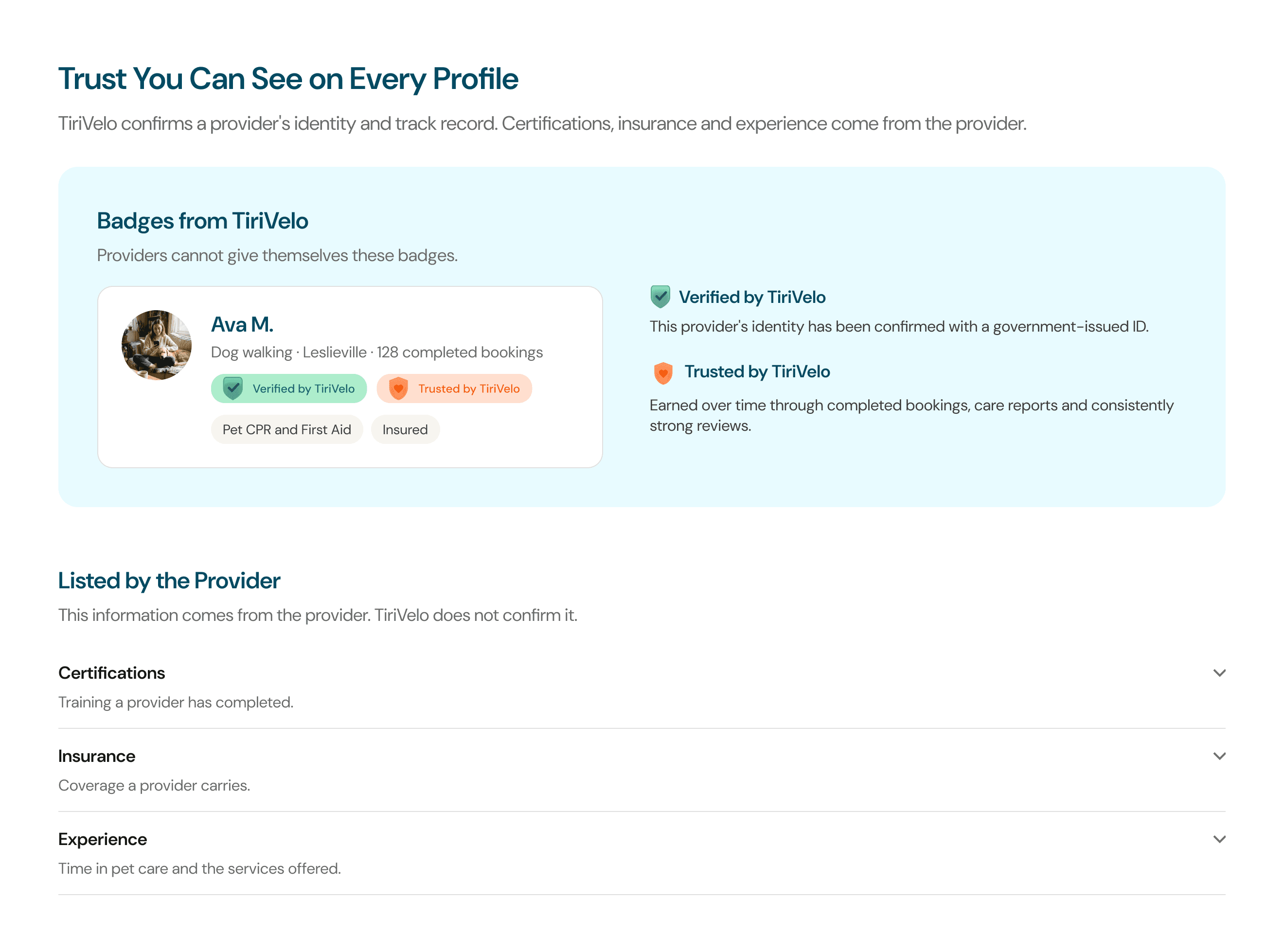
A provider's profile mixes two kinds of information. Some of it TiriVelo confirms, like identity. The rest comes from the provider, like certifications and years of experience. On the profile, both looked the same, so I split them into two sections:
•
Badges From TiriVelo: Verified and Trusted each get their own color and a short line explaining what earns them. An example provider profile shows both.
•
Listed by the Provider: What providers share sits underneath as a simple list.
•
Marked as Pending: The background check details weren't decided, but removing the step would make the process look incomplete. I marked it in orange as coming soon so the gap stayed visible to the client. Once they confirmed checks would happen no matter which company they chose, I replaced it with one broad, accurate line.
•
Photos That Build Trust: The CEO wanted a photo for every step in the approval process, but showing IDs or documents could look like TiriVelo exposes personal data. I chose photos that signal trust instead, like a leash being clipped onto a collar for the background check step.

Testing & Iterations
With no users to test on, feedback came from the CEO, their lead UX designer and my mentor. The page went through six versions before handoff.
•
Feedback: The CEO said the six numbered steps in my first version read like a checklist.
•
Second Version: I turned them into a vertical path with an icon for each step. Beside it, I added the provider sign-up screen as an example of the real product. The CEO thought owners might see it as the place to upload an ID or certification.
•
Final Iteration: I replaced the screen with photos for each step.
First Version: Numbered Steps

Second Version: Vertical Path

•
Feedback: The CEO said the badge section was too dense. He also wanted what TiriVelo checks and what providers list to feel more distinct.
•
Final Iteration: TiriVelo's badges moved into their own panel with an example profile. Provider details became short rows below it that open for more detail.
Earlier Version

•
Feedback: The CEO wanted the approval section to feel more alive and visual.
•
Version One: Steps alternate left and right down the page. Each one sits beside a photo and gets plenty of room.
•
Version Two: All five steps sit in a horizontal stepper. Clicking a step swaps the card below it. The page is about 1,000 pixels shorter.
•
Final Iteration: I presented both to the CEO. He chose to move forward with the alternating version.
Version One: Alternating Steps

Version Two: Horizontal Stepper


Results
The CEO and lead UX designer signed off on the final page. TiriVelo's approval process used to live only in internal designs. This page puts it in front of the people who need it.
•
For Pet Owners: They can see the five steps every provider completes and tell which details TiriVelo has confirmed.
•
For Future Providers: They know what signing up involves before they apply.
•
For TiriVelo's Team: I handed off an annotated Figma file and working prototypes they can build from. The CEO described the work as a foundation his team could review, refine, and keep developing.
"This is a very challenging page that can easily be overloaded with too much information. You did a good job."
Michael Navarro, Founder & CEO, TiriVelo
Final Page: Scroll to Explore

Final Thoughts
TiriVelo's approval process already existed. My job was to make it visible. That taught me that design work is sometimes about organizing what's already there. It also showed me how much the details matter. On a topic this important, every claim on the page has to be correct. TiriVelo was growing and things changed quickly. I confirmed each detail with their team and kept checking back so the page stayed accurate. Their feedback taught me one more thing. What seemed clear to me wasn't always clear to someone seeing it for the first time. Now I share my work early so others can catch what I miss.
Next Steps
•
Test With Pet Owners and Providers: See whether pet owners come away feeling safe trusting TiriVelo with their pet and whether future providers understand what signing up involves.
•
Finish Before Launch: Add the background check details once TiriVelo picks a company. Then have their legal team review the page.
•
Design a Mobile Version: I designed the page for desktop. Next I'd design a mobile version so people can view it on their phones.
•
One Consistent Message: TiriVelo describes what makes it trustworthy in three different ways across its site. I'd bring those together into one message used everywhere.
What I'm Most Proud Of: Turning a topic that competitors bury in walls of text into a page people can understand at a glance. I'm also proud of how much it grew through six rounds of feedback. Each version was easier to read than the last.